 Movable type image via wikipedia

Written by John Reed
When it comes to WYSIWYG content management in WordPress, there are plenty of options to extend your site’s editing experience. After working with page builder plugins like Elementor and Visual Composer, however, we’ve come to embrace the simplicity and reliability of the native block editor (aka Gutenberg). That said, we’re also big fans of the Bootstrap toolkit and wanted a simple way (i.e., without writing custom blocks) to leverage its components and utilities to extend the block editor. So, in the latest reboot of this very website, we found a way to do just that.
Integrating Bootstrap Styles into the Block Editor
First thing’s first: pull in our site’s styles into the block editor so we can better represent the front end without having to click “Preview.” With the classic editor, one only needed to call add_editor_style() and pass in URLs to CSS files. The block editor, on the other hand, requires that we first register support for this using the add_theme_support() function:
add_theme_support( 'editor-styles' );
We can pull in our custom styles now that we’ve added support. We do this by hooking into the “after_setup_theme” action. Here, we are pulling in the Bootstrap framework, our theme’s stylesheet, and an additional CSS file to customize a few things in the block editor:
<?php
function cre8_add_editor_styles() {
    add_theme_support( 'editor-styles' );

    add_editor_style( [
        'https://stackpath.bootstrapcdn.com/bootstrap/4.5.0/css/bootstrap.min.css',
        'style.css',
        'css/editor.css',
    ] );
}
add_action( 'after_setup_theme', 'cre8_add_editor_styles' );
Our editor.css is pretty sparse, but we use it in order to increase the width of the editor and to set the background color to transparent (this ensures that the parent element’s background shows through Custom HTML blocks, which use iframes)
/* reset body background */
body {
    background-color: transparent;
}

/* Main column width */
.wp-block {
    max-width: 1110px;
}

/* Width of "wide" blocks */
.wp-block[data-align="wide"] {
    /* we let this inherit the max-width set above */
}

/* Width of "full-wide" blocks */
.wp-block[data-align="full"] {
    max-width: none;
}
Adding Groups and Utility Classes in the Editor
Let’s get to work now that we have access to Bootstrap utilities within the block editor.
A typical design pattern we employ on this site is a full-width color panel with a column centered within the viewport. If we were coding this by hand, we might do something like the following:
<!-- applies the primary background color across the entire "panel" -->
<section class="bg-primary">
    <!-- contain, pad and center content -->
    <div class="container">
        <h1>Hello, world!</h1>
    </div>
</section>
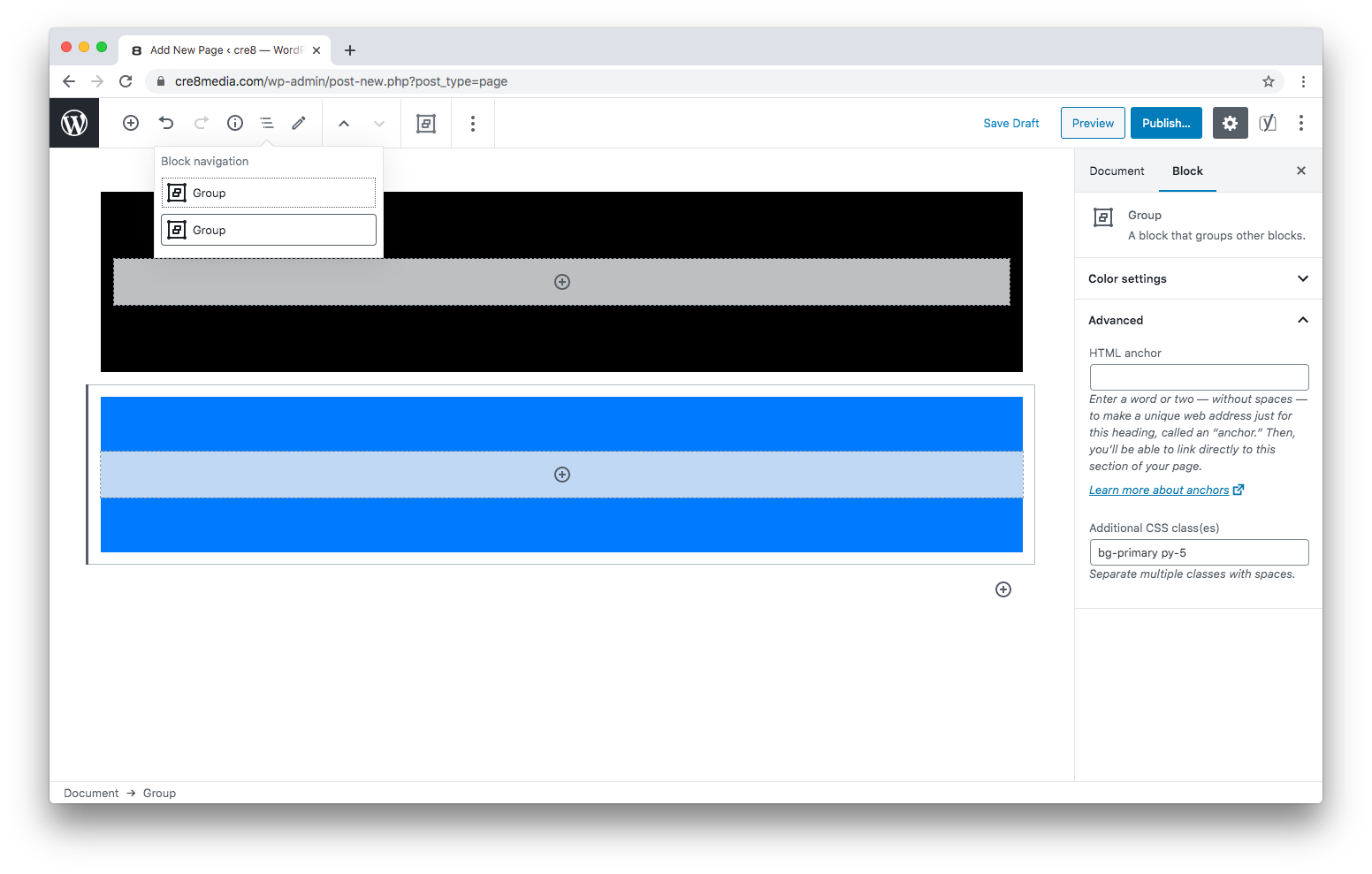
To emulate this using native blocks, we can use the Group Block. First, we add a Group, and under the “Advanced” section, we can add our “bg-primary” class to the “Additional CSS class(es)” field. We also added the “py-5” shorthand class provided by Bootstrap’s Spacing Utilities to add some padding to the top and bottom of this block.
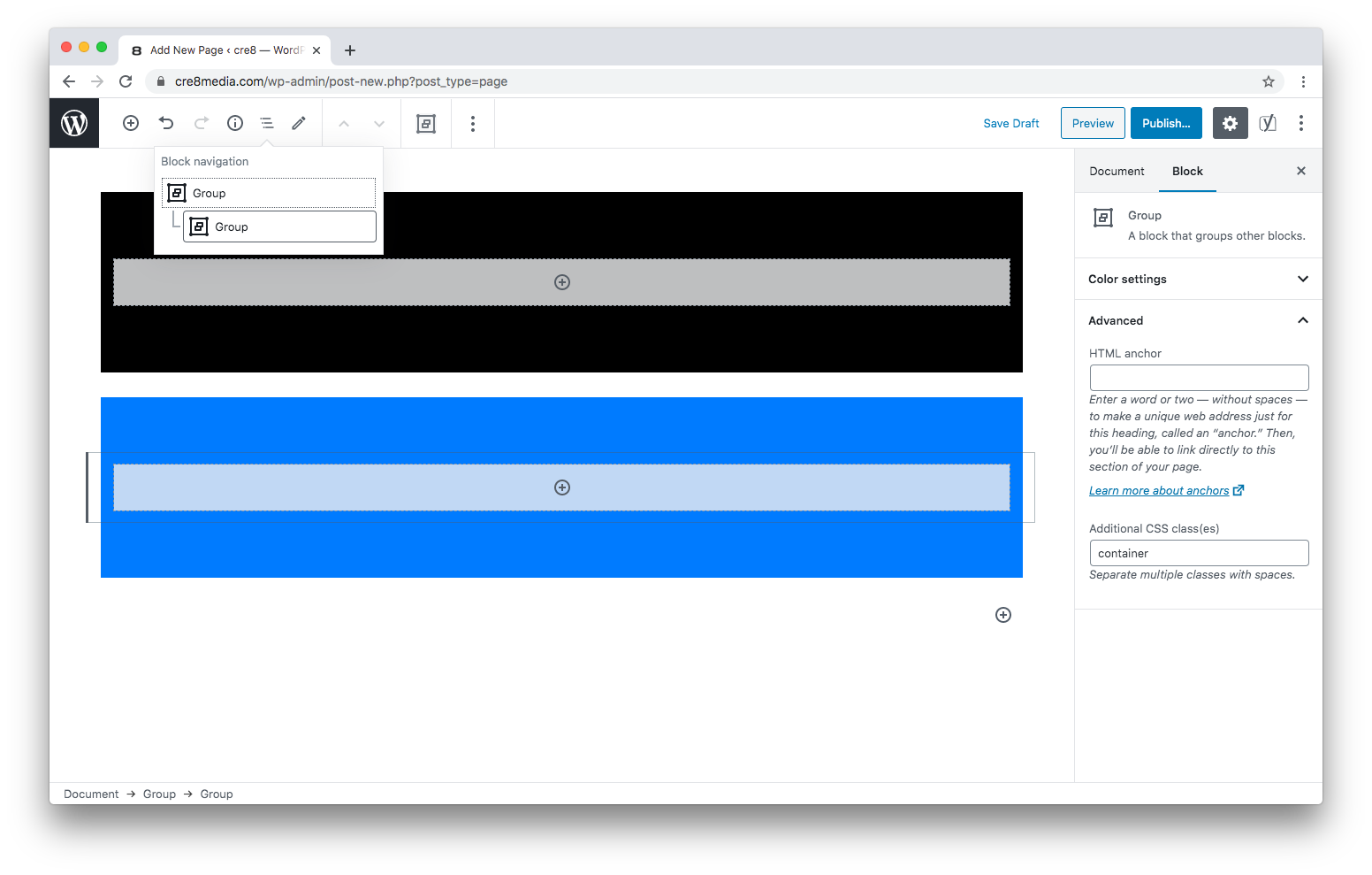
To center our content, we nest another Group block, add the “container” class, et voilà!
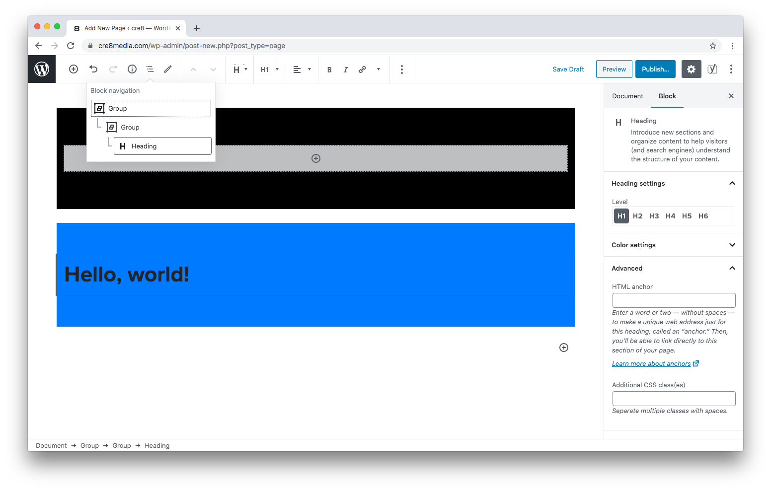
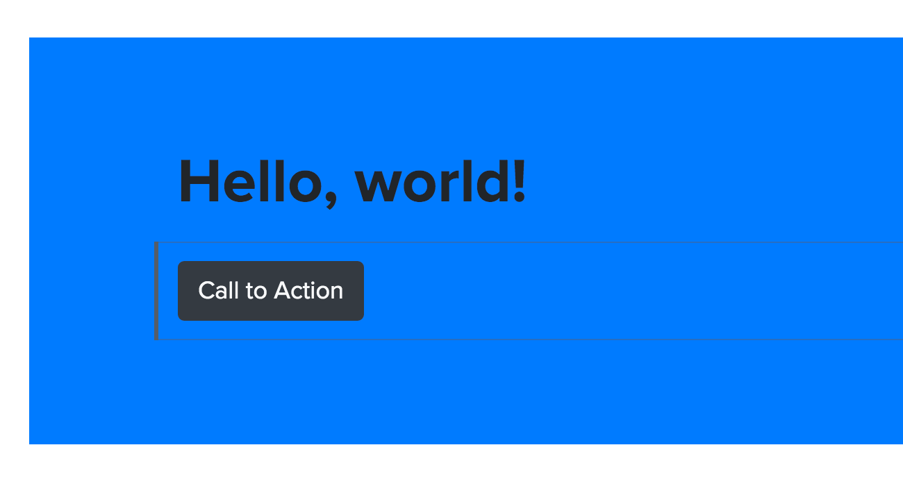
Now blocks added within this second group will be centered within the viewport:
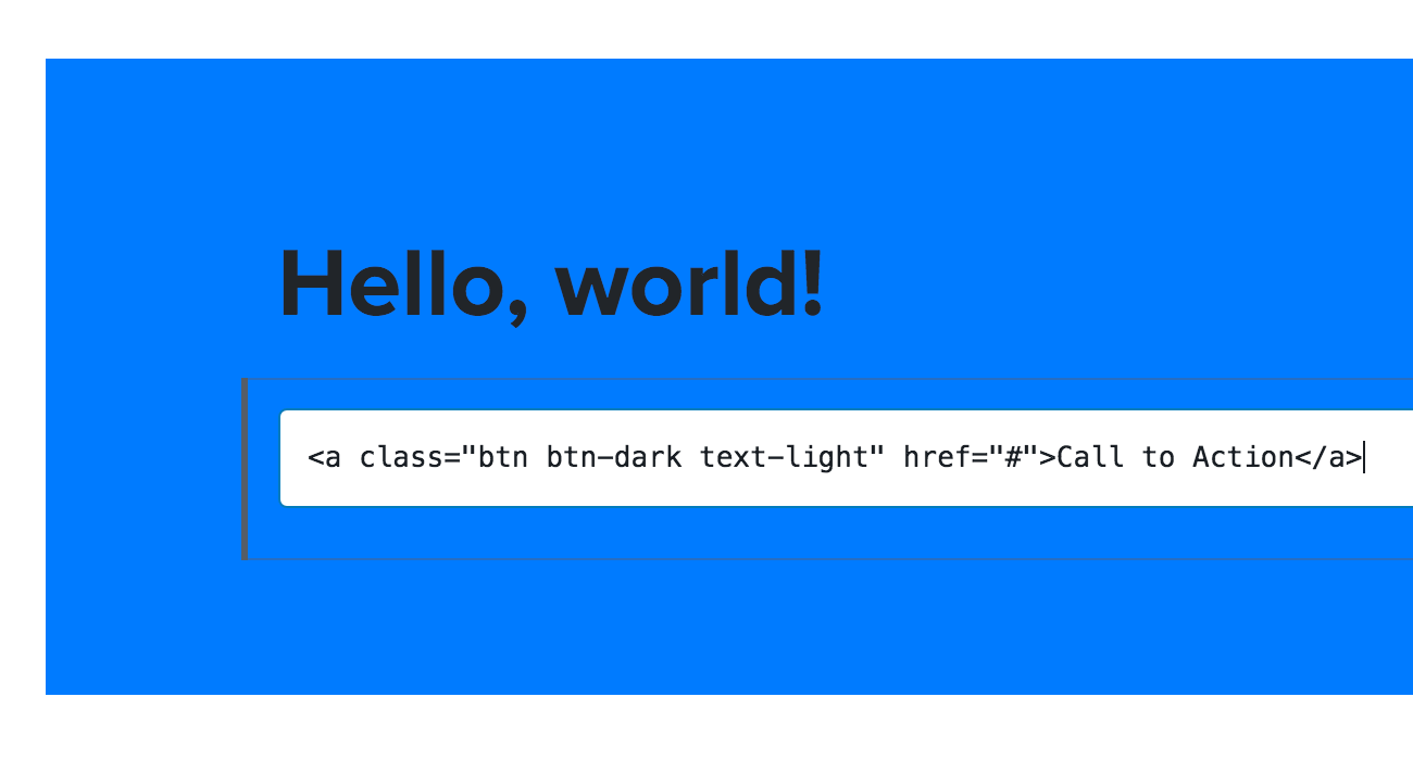
While this is a relatively straightforward structural example, with access to Bootstrap classes, we can now quickly add custom HTML and see the results in the editor itself:
Need help with the block editor or other facets of your WordPress site? Contact us!
Movable type image via wikipedia